Nintendo has officially shared the first images of the Nintendo Switch Online app for the Switch 2 via its Japanese website — and to the disappointment of many fans, it looks almost identical to the original Switch interface. Despite high hopes for a fresh, more modern redesign, Nintendo seems to be sticking with the same minimalist approach that left many underwhelmed the first time around.

Back in the DS and Wii U days, Nintendo was known for its unique, character-rich UIs — full of charm, personality, and memorable background music. But that creative identity was lost with the original Switch, replaced by a cold and overly simplistic layout. And now, it looks like Switch 2 is continuing that exact same path.
Key Features of the Switch 2 Online App:
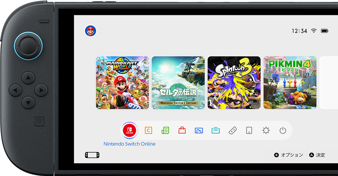
Main Menu Icon: Located at the bottom-left corner, next to the GameChat icon.
Rounded Design: Slightly updated visuals, but still very similar to Switch 1’s UI.
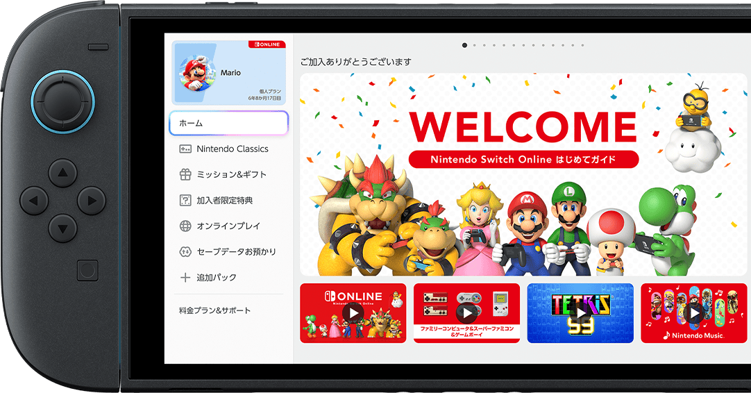
Welcome Screen: Introduces users to the app with a basic greeting layout.
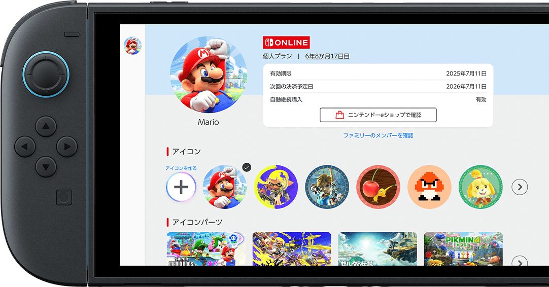
User Info & Subscription: Shown in the top-left corner of the screen.
Cloud Saves, Missions, Subscriptions: Listed on the left-side menu for quick access.
Tab Switching: Navigate sections using the L and R buttons.
Customizable Icons: Still allows player icon customization, just like on the original Switch.
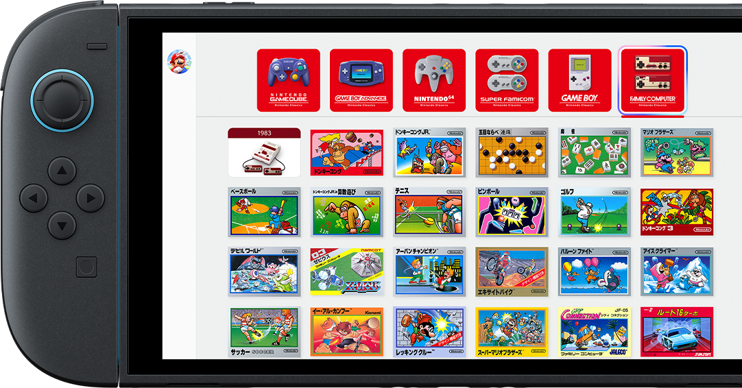
Nintendo Classics Menu: Shows available console apps for Switch Online members.
GameCube App Support: Expansion Pack subscribers will now have access to GameCube titles, with more games coming over time.
While some may appreciate the consistency, for many Nintendo fans this feels like a massive missed opportunity. The cluttered, sluggish eShop experience — often called one of Nintendo’s worst interfaces — appears untouched, and the UI overall lacks the polish and charm Nintendo once delivered with ease.

Here’s hoping Nintendo eventually pushes a real update that brings back the creativity, warmth, and detail we used to expect from a Nintendo system.